One Direction are a great example of a successful group with amazing marketing behind them. We studied and analysed their website in order to employ some of these techniques on our own since we are both groups targeting a core market of teenage girls. Contestants on 2010’s series of X-Factor, originally all the boys auditioned as individual artists, however they were put together by the production team in the Bootcamp stages of the show and went on to finish third. Simon Cowell’s label SYCO decided to sign them anyway given their popularity and the enormous amount of public good will they received. The band already had a prime time fan base that had witnessed their whole story so the marketing team behind One Direction decided to exploit this and play on their individuality. The boys ranged in age from 17-20 and already had a broad appeal and diversity; 1 Irish, 1 Asian, 3 Caucasian. This set up allowed fans to have their favourite- a strategy similar to that of the Spice Girls. The boys core or primary target market was that of young girls aged 7-14 due to their good looks, style and charisma, but marketers also noted that they appealed to secondary markets of mums and older teenagers. Marketing looked at their audience pluralistically, playing on certain things to appeal to each market, e.g sexiness for older teens, ‘safeness’ for mums.
Since forming just over a year ago, One Direction have gone onto monumental success. Tickets for their first tour sold out in a record breaking time of just 10.6 seconds and their debut single ‘What Makes You Beautiful’ went straight to number 1, winning the accolade for fastest selling single of 2011.
Their website is the hub of the whole marketing campaign and cleverly utilises Web 2.0 and social media to appeal to their young fanbase. The website features a consistent brand image throughout and uses a multiplatform strategy to promote a 360degree targeting of their broad audience. Marketers have exploited the 5 key areas for a successful campaign: Broadcast and traditional media, press and publicity, social media, endorsements and merchandise and examples for each can be found on the website. Here are some examples of the different ways fans can interact with or ‘own’ the band:
The video I have chosen to comment on in reference to intertextuality is Pink’s ‘Stupid Girls’ which sees the singer assume various roles parodying the stupidity of image obsessed Hollywood-ites with references to the celebrity culture that surrounds and influences us. Not only is the video littered with intertextuality and low culture references but also comments on the portrayal of women in the media and questions the lack of positive role models for young girls.
"I live in L.A., so it's obvious what I'm surrounded by. ... I don't need to name names,"-Pink
The video was directed by Dave Meyers, a well known Grammy award winning American Music Video director in 2006. The song deals with the idea of aspiring to be more than just a ‘stupid girl’ encouraging individuality and ‘outcasts and girls with ambition’. When asked about the lyrics, Pink said "there's a certain thing the world is being fed and my point is there should be a choice."
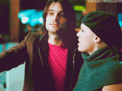
Echoing this, the music video begins with a young girl watching television as an angel and devil Pink appear on either side, a frequently used metaphor in film and television for her conscience. The girl flicks to a channel showing an etiquette class in black and white, displaying the dated ideals of how women should behave- flicking their hair and copying the teacher, robotically and devoid of emotion. She then changes channel to see a young female celebrity visiting a Fred Segal store dressed in the popular at the time Boho-chic style, mimicking Mary Kate Olsen. Fred Segal is notoriously known as a hang out for wealthy celebrities and trust-funders, a paparazzi photo opportunity with Pretty Women-esque shop assistants. By including this reference Pink and Meyers are already painting a picture of the type of people the song and video are poking fun of. She is then seen walking into a glass door which is immediately juxtaposed by a clip of Pink as a female president, displaying a common theme that continues throughout the video of a fragmentation of sensibility- cross cutting clips of female empowerment such as a president and football player with those of airhead clones. Through this Meyers forces the audience to challenge the superficial stereotype and explore their potential by promoting alternative positive role models for young girls and ridiculing the negative. His efforts are similar to ideas in feminism of women taking control of their own lives and being seen as equal to men both professionally and personally.
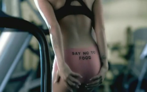
Throughout the video Pink also assumes roles as a dancer in a 50 Cent (played by his own cousin!) video, a girl trying to impress a male trainer at the gym, a woman with inflatable breasts, an orange girl at a tanning salon, a bulimic, a mutton-dressed as lamb type wearing a pink tracksuit and a girl getting plastic surgery. These are all clear references to stereotypes of our popular culture but there are also other intertextual references, in the forms of parodies of young female Hollywood celebrities. This includes a girl sexually washing her car (Jessica Simpson), a redhead distracted by her reflection driving her car into people (Lindsay Lohan) and a girl making a sex tape (Paris Hilton- ‘One Night in Paris’).
Pink and Jessica Simpson
Pink and Lindsay Lohan
Pink and Mary Kate Olsen
Pink and Paris Hilton
The video is a post-modern pastiche commenting on society’s obsession with appearance and fame, portraying it so comically to the point of stupidity…as the song suggests. The video however has wider significance, illustrated through the character of the young girl. The fact that this behavior is all around and is permeating the minds of women of all ages is worrying and thought provoking. Although funny on the surface, the video has deeper meaning, using recognisable intertextuality to appeal to its target market of females. The issues raised, particularly that of the bulimic in the toilet make people sit up and take note and it is worth mentioning this video was released around the time of the ‘size 0’ furore. The fact that the video ends with the girl choosing her computer, football, books, dance shoes and keyboard over make up and dolls reinforces the idea that a rounded selection of hobbies trumps vanity and sets out a positive example.
The video was well received by audiences and won the 2006 MTV Video Music Award for Best Pop Video. It was also heralded by author J.K Rowling on her website where she praised it for ‘satirising the talking toothpicks held up to girls as role models’.
During class we discussed our findings on our particular album artworks and the typical conventions of an album cover. To summarise:
Albums can come in many different formats e.g digipack, double CD, special edition etc...
Typical institutional information featured on the back cover, e.g bar code, copyright info, record label
All have front & back covers and spine (with text always facing the correct way)
Consistency of brand can be established through visual signifiers (band logo, particular font, colour scheme)
'The front cover sells the artist and the back cover sells the album'-Sam Szczurek
Differences between compilations and soundtracks to regular albums
Differences between debuts and established artists (debuts more likely to 'play it safe' unless they are deliberately trying to provoke a certain reaction)
Cover art dependant on a variety of different things including genre, era, institution, audience...no clear set rules just needs impact and to fulfill its purpose of making a customer want to buy it
Album covers may have a set FORM (conventions) but it is the STYLE that differentiates them (this is dependant on the things listed in the point above)
This is the debut album 'The Soul Sessions' by Joss Stone (2003). This album was released when she was just 16 but her classic, soulful vocals way beyond her years quickly ensured the albums success both critically and commercially (it went multi-platinum). The album cover features a picture of Stone obstructed by and singing into a recording studio microphone, denoting that it is her voice and music that is the USP and there is no need for her to be objectified. The whole style of the artwork, front and back, is designed to look very retro- the font on the track listing is that of a jukebox and the front features a gawdy style 60's type face synonymous with the era. Visually, the designers seem to have been inspired by other famous albums of the soul genre. The monochromatic purple theme (which was continued on her later album artwork) is similar to that of Otis Redding's album (pictured right). The obstructed shot is reminiscent of Sam Cooke's and the focus on her eye bares an uncanny resemblance to Mavis Staples' Only For The Lonely. Stone's record label looked to the past to promote a contemporary artist with a classic voice and the meeting of the two resulted in huge marketability coupling with her songs huge playability ensuring lucrative success.
When researching different album covers and artwork I found this great site with 100 of the most obscure and remarkable... check it out here
1. What are the typical features an album cover has?
Name of artist
Name of album
Some kind of imagery (may be but not always a photograph of the artist)
Back cover: Track listing, bar code, institutional info
2. How would you categorise the covers? Are there any other ways of distinguishing between them other than generically?
I had rarely given it much thought but whilst looking through my CD collection I noticed how few albums actually had a cover of the artist themselves. Often this is a genre signifier and mainstream, pop hits are perhaps more likely to feature the artist on the front as their look is a key selling point for the record label so they will play on this. However more indie/alternative bands seem to favour interesting visuals, often relating to the title of the album, the feel of it, the bands image or in some cases none of the above. Debut albums generally seem to be a bit more striking as they need to be to fufill their purpose of making people want to buy it and establish a fanbase for the artist. Also they often feature the band since otherwise many will not know what they look like....but sometimes this is deliberate.
3. Album covers serve many different functions. What do you think these are?
The album cover needs to serve as an expression of the artist themselves. Sometimes it will help to illustrate the style of the songs on the album, or perhaps the inspiration behind it. It needs to catch potential customers' eyes and make them want to buy it (controversy and shock tactics can help do this successfully). It needs to appeal to its target market and display some sort of brand identity, be it a colour, logo or font. It also needs to supply the relevant industry information such as track listing, record label and copyright info.
Interesting covers and the stories behind them:
The Wombats- A Guide To Love, Loss & Desperation
In order to acheive this cover, The Wombats collected items from their teenage years and bric-a-brac important to and influencing them and their sound and created a collage. In between all the random objects are cut outs of the three singers holding POP signs in bright colours- denoting the genre as well as making them appear quirky and colourful.
Arctic Monkeys- Whatever People Say I Am,
That's What I'm Not
This is the cover for the Arctic Monkeys debut album 'Whatever People Say I Am, That's What I'm Not'. The artwork is an image of The Violet May frontman and brother of Jon McClure from Reverand and the Makers, Chris McClure. It was taken in the early hours of the morning in a bar in Liverpool after the band had given him 'seventy quid to spend on a night out'. It has been crticised for promoting smoking however in response to this, the band's product manager allegedly stated that it had the opposite effect as from the photograph you can see that 'smoking is not doing him the world of good'.
In Utero (1993) is the third album by iconic rock band Nirvana. Its artwork is a mix of ideas by Kurt Cobain, the famous frontman and art director Robert Fisher. The album got its title from a poem by Courtney Love and the back cover is a photograph of a collage created by Kurt Cobain on his living room floor. The imagery relates to the title of the album, regarding the female body as well as being an abstract expression of the frontman's feelings towards music and his sudden catapult to fame. The back cover also contains symbols from the Woman's Dictionary of Symbols and Sacred Objects, again continuing the theme.
"Music videos are often spoken of as "low culture" because of their accessibility, so it's great when a song is given a lease of life through the video." Saam Farahmand
I'm pretty much obsessed with Partizan. They are a production company specialising in many branches of multimedia including animation, documentary, online innovative digital and interactive work, films (including Eternal Sunshine of the Spotless Mind (2004) and Be Kind Rewind (2008)), commercials and of course music videos. So when we were asked to write a post analysing music videos using the auteur theory, I immediately knew I would choose one of their previous directors known cooly in the business as SAAM or slightly less cooly as Iranian ex-would-be-scientist Saam Farahmand. After attending a Bruce Nauman show at the Hayward Gallery Saam abandoned plans of academia and studied fine arts at Goldsmiths before moving into directing. He gained notoriety after creating online viral videos including a mash up of Bush and Blair to 'Gay Bar' by Electric Six and 'Viral Insanity' a parody of the Jamiroquai video which gained him work for MTV2, in turn leading to directing stints for artists such as Klaxons, Janet Jackson and Simian Mobile Disco. NME included him on a list of 'people pushing music forward' and in 2007 he won Best Director at the CAD Music Video Awards.
"It’s always different, but I guess in its purest form it’s the reverse of what a composer like Giorgio Moroder would do when he creates a soundtrack to a film. It sounds cheesy, but making a music video is like creating a visual score to a piece of music."
As Saam's background is in art, his videos tend to be highly conceptualised, visually dynamic and often with interesting contemporary choreography. The band or artist tend to be less the focal point of the video but serve more as a cast member to a visual piece concerning a wider issue than the song's subject, though perhaps derived from its lyrics. I have chosen three of my favourite video's of his to analyse below:
The xx- Islands (2010)
Personally I think this is a work of pure genius! On first viewing, I immediately watched it over again and again playing a sort of 'spot the difference' with myself from scene to scene. Risky as it may be to shoot the whole video in one repetitive backwards track, coupled with the song and the subtle differences in choreography each time, Saam cleverly manages to tell the story of several couples through movement. The xx logo is littered all over the screen, serving as a constant reminder of brand identity targeting the audience immediately and incredibly apt for a debut single. The mis en scene, bluey hues and repetition create a hypnotic quality which accompanies the song brilliantly and the indifferent, slightly subdued expression of the band portray them as cool and laid back. The climax of the video illustrates the breaking down of a relationship as the routine is interrupted, dancers leave and the set catches alight. I can't quite decide whether the video illustrates, amplifies or contradicts the lyrics as the song on the surface seems to be about someone finding their love therefore stopping them from exploring other 'islands'. Personally however, I believe the video beautifully displays how the characters are just going through motions habitually, lacking the passion they once did. The song and video, like a piece of artwork can be interpreted in a variety of different ways and that for me is the beauty of it.
Cheryl Cole Featuring Wil.I.Am- 3 Words (2009)
The split screen effect in this video is so effective for a duet and Saam, challenging music video conventions uses a long fluid shot, making the video appear as one long take. Although the dancers are not wearing many clothes, the choreography is not sexualised but adds interest to the scene.Visually the video matches the song in pace, the slower parts are accompanied by slow pans of the dancers on the floor whereas the faster drum beat parts feature them dancing. Saam has used interesting editing techniques to make all the shots match up and bringing the shots of the artists together and apart again, warping the viewers ideas of time and space.
Tom Vek- Aroused
“It’s a nod to the way in which smoking is used heavily and quite innocently in art and fashion … In the video, it represents feelings of being overwhelmed and extremities — both of which tie in with the sentiment of the album.”-Tom Vek
Saam has managed to capture the style of an fashion ad campaign, the models, the random text, the sultry poses, soft lighting and the black and white grading in this video. The smoke works aesthetically to create patterns in the shots and contribute to the slick and stylish cinematography. Saam gets a great performance out of all of the actors and once again uses choreography to create interesting and unique compositions in each frame, particularly towards the end. The subject matter of this video is controversial, what with the obvious health risks associated with smoking, however with reference to the idea Vek explains above is almost a tongue in cheek parody of a fashion editorial and suggests it is not to be taken too seriously.
No two of Saam's videos are alike. Infact, he even made two different videos for the same Klaxons song, rendering him as possibly the only director to remake his own work. His strength lies in the creative and he is constantly pushing the boundaries with every project he undertakes, understandably making him one of the most sought after directors currently and definitely one of my favourites. All that and he's only 30! There are a few conventions however that seemed to crop up in most of his videos...so, to summarise:
SAAM: the go-to guy for a cool, replayable interesting video
Often Controversial
Strong use of Slow Motion and interesting post-production
Challenging and breaking Music Video Conventions- Risky
Echoes and amplifies image of artist
Unique visual style
Interesting choreography- not sexualised but contemporary
Over summer I had a number of ideas for possible tracks for our Music Video coursework project. After downloading the Foster The People album, I came up with an idea for a track called 'Love'
I thought the lyrics and pace of the song would lend itself well to a speed dating set up, whereby the male band members could be attempting to impress uninterested girls. The video would be easy to film; a simple set up in the Seward Studio and our group (me, Jess W and Odelia) could all star in the film (as the girls) whilst also balancing production roles. However, due to the unique voice of the lead singer it would be difficult to cast a performer appropriately and effectively and any attempt at marketing a band with this sound would probably just result in a similar version of Foster the People themselves. This led me to move onto the idea of a girlband...
Puppet is a great, catchy pop song and immediately I could envision a very girl empowering video featuring a man under command and 'puppeteered' by the girl band. As all three of us have dancing backgrounds, we could choreograph a routine for a performance too as well as featuring conventional girl band beauty shots and a concept driven narrative. However, after discussing with the group we did not just want to be a 'karaoke' version of The Saturdays and it seemed pretty futile trying to imitate a successful girl band that already do what we want our fictional artist to do, and do it well. We began thinking more about the whole promotional package side of the coursework rather than just the video alone so are now deciding to opt for a song that does not have a popular or well known artist attached to it, leaving us the freedom to be creative in our creation of an artist. The song search continues...!
As a class we discussed the song choices we had posted on our blogs. The Music & Me lesson not only allowed us all to get a glimpse into each other's personal music archives but also to consider the reasons we chose the songs we did. Despite differing musical tastes now, generally we seemed to chose similar songs under the 'childhood' category by bands such as Busted and S Club 7, and failing that chose tracks heavily influenced by our parents or older siblings (like mine for example). The fact that we all had a mutual appreciation or at the very least knowledge of the songs each other had chosen for childhood told us a lot about the consumption habits of this younger age group; mostly listening to the radio perhaps in the car with parents, in the morning at breakfast etc but above all generally having one main palatable source before we began to develop our own personal tastes. The songs we liked were mainstream and our friends seemed to like them too- I guess you could say there was a bit of 'herd mentality' but it satisfied our deeper need for personal relationships and inclusion in the group (Bluhmler and Katz's Uses and Gratifications Theory) and this is important-especially as a child.
Evolution of my Radio consumption & influences
Also in the case of supergroups like S Club 7 and the Spice Girls it was the whole brand working in synergy to promote their music that made them so influential to us. Through merchandise. TV shows and films, these bands targeted us via every possible marketing platform and presented an aspirational image that as children we looked up to and our parents were happy to buy into because they promoted 'safe' and 'clean' fun.
Technology too has come a long way since we were younger. We may be heralded as 'digital natives' but deep down we're still 90's kids and yes we remember (occasionally fondly) buying and using cassette tapes! Nowadays 8 and 9 year olds are on the internet and can have access to pretty much any song of their choice via iTunes or YouTube. Perhaps as broadband speeds continue to get faster and younger generations become more electronically able, children will begin to develop their own musical preferences at a younger age…or record companies will find a way to replicate the fandom we remember into the digital age…or maybe it's already happening. Two words: Justin Bieber. Anyway! It is important to understand different audiences and their consumption habits in order to successfully market our artist effectively when we come to the coursework project.
It also became clear through our discussion that as we began secondary school we became more discerning music fans and perhaps swayed more towards a certain genre or band of our own choosing rather than just following the crowd. When asked about the significance of our choices there were a variety of responses, from reminding someone of a particular person, place, feeling, TV show, relatable lyrics or a live performance that had stayed with them in some way. We all agreed how powerful and encompassing music is; the emotion that a particular song can bring out in a person is unrivalled. Over time our tastes may have broadened, we may have gone through phases (lets not mention Haduoken!) but music has always been there throughout and will always continue to be.
I always wonder if people like the same songs for the same reasons. Well, here are mine...
Van Morrison- Brown Eyed Girl
This song is really special to me on so many layers. Firstly, I grew up listening to Van Morrison since my mum is a huge fan and my grandparents and most of her side of her family are Irish and every time I hear this song I can see my granddad dancing around his kitchen, flat cap on, me on his toes, belting out the words with a cigar in one hand and a whiskey in the other. I’m comforted by the fact that whenever I get stressed out or things are changing that Nanny Nora and Granddad Pat are a constant- drinking litres of tea in their tiny terrace in Cork and when I hear this song it never fails to make me dance like I’m there with them.
Air Traffic- Shooting Star
When I hear this song it literally catapults me to being 13 and confused about, well everything! Boys, appearance, going out…I was growing up! It felt as though I was the exact right age at the time of ‘myspace’ obsession when uploading self created content was just beginning to take off and I developed a really strong interest in music at this point, discovering new bands and photographing at gigs at the Astoria, Nambucca and Tin Pan Alley Festival. I’ve always admired the art of song writing and I am so in awe of beautiful songs with beautiful lyrics- it’s like I should have two iPods; one with those songs you blast out at parties with your mates and one with those you listen to on your own, the songs that move you, make you think, reflect and put into music what you can’t seem to put into words. This song is no exception and also has personal significance as one night laying in a field near my house, my friend Tom and I both saw a shooting star. It was such an impossibly special moment and I will never ever forget it.
Mumford and Sons- Unfinished Business (White Lies Cover)
These are all pretty personal anecdotes about my relationship with music and they’re all interlinked which just shows how much of an involvement and influence these songs have had on my life. I met a boy at a festival in 2007 and through a very random series of events ended up meeting him again at a friend’s gig this January. He introduced me to the White Lies version of this song and I actually won tickets to see them at the iTunes festival which was incredible and definitely worth skipping work for…:) I chose to post the Mumford and Sons cover though because not only do I think the vocals are hauntingly moving but it really makes you focus on the lyrics which although tell a story are very relatable. This song came into my life at a time when I was so happy and although it has quite a sombre feel, the lyrics ‘so get off your low and let's dance like we used to’ have such a positive, affirming and nostalgic quality and it always makes me think of this year which has been one of the best of my life...so far atleast!


 Echoing this, the music video begins with a young girl watching television as an angel and devil Pink appear on either side, a frequently used metaphor in film and television for her conscience. The girl flicks to a channel showing an etiquette class in black and white, displaying the dated ideals of how women should behave- flicking their hair and copying the teacher, robotically and devoid of emotion. She then changes channel to see a young female celebrity visiting a Fred Segal store dressed in the popular at the time Boho-chic style, mimicking Mary Kate Olsen. Fred Segal is notoriously known as a hang out for wealthy celebrities and trust-funders, a paparazzi photo opportunity with Pretty Women-esque shop assistants. By including this reference Pink and Meyers are already painting a picture of the type of people the song and video are poking fun of. She is then seen walking into a glass door which is immediately juxtaposed by a clip of Pink as a female president, displaying a common theme that continues throughout the video of a fragmentation of sensibility- cross cutting clips of female empowerment such as a president and football player with those of airhead clones. Through this Meyers forces the audience to challenge the superficial stereotype and explore their potential by promoting alternative positive role models for young girls and ridiculing the negative. His efforts are similar to ideas in feminism of women taking control of their own lives and being seen as equal to men both professionally and personally.
  Throughout the video Pink also assumes roles as a dancer in a 50 Cent (played by his own cousin!) video, a girl trying to impress a male trainer at the gym, a woman with inflatable breasts, an orange girl at a tanning salon, a bulimic, a mutton-dressed as lamb type wearing a pink tracksuit and a girl getting plastic surgery. These are all clear references to stereotypes of our popular culture but there are also other intertextual references, in the forms of parodies of young female Hollywood celebrities. This includes a girl sexually washing her car (Jessica Simpson), a redhead distracted by her reflection driving her car into people (Lindsay Lohan) and a girl making a sex tape (Paris Hilton- ‘One Night in Paris’).


 Technology too has come a long way since we were younger. We may be heralded as 'digital natives' but deep down we're still 90's kids and yes we remember (occasionally fondly) buying and using cassette tapes! Nowadays 8 and 9 year olds are on the internet and can have access to pretty much any song of their choice via iTunes or YouTube. Perhaps as broadband speeds continue to get faster and younger generations become more electronically able, children will begin to develop their own musical preferences at a younger age…or record companies will find a way to replicate the fandom we remember into the digital age…or maybe it's already happening. Two words: Justin Bieber. Anyway! It is important to understand different audiences and their consumption habits in order to successfully market our artist effectively when we come to the coursework project.


