

Our final video uses and develops on typical forms and conventions of music videos but also challenges them too, particularly in the context of gender roles and objectification of women.


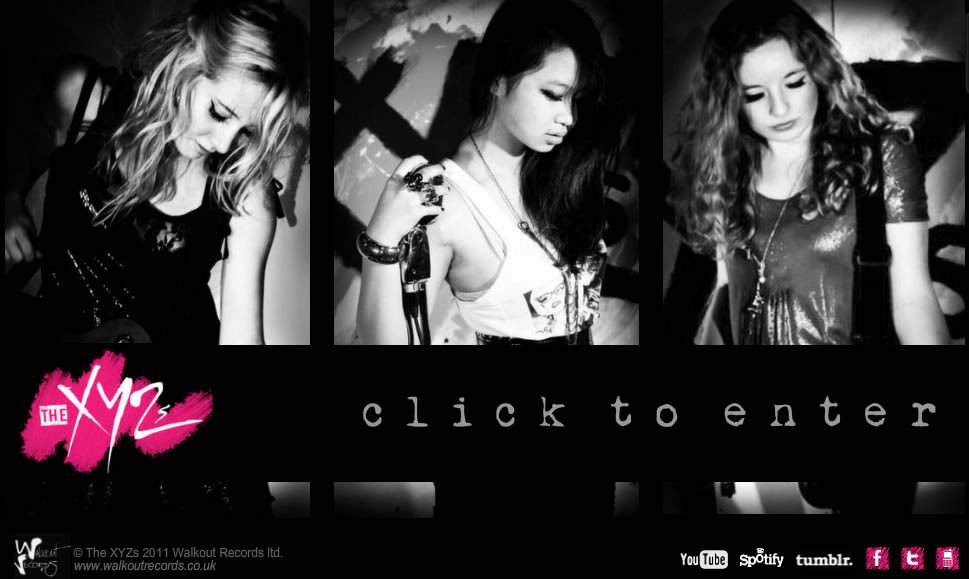
 As a girl band, styling was very important in order to present the band so that they would appeal to our target audience of teenage girls and traditionally, a girl band’s image is exploited to sell. We did a lot of research into our styling, creating various moodboards and putting a lot of thought into the clothes. Glam rock in the past has been noted for its sexual and gender ambiguity and representations of androgyny, however we wanted to present ourselves as very feminine but still very empowering. We also wanted demonstrate characteristics of the pop rock/ glam rock genre through our dress code, make up and other visual signifiers and therefore decided on a trendy but rocky dress code of glam goth, meaning lots of black and heavy jewellery but with touches of girliness e.g the metallic top, platform heels and pink dip dyed hair and a black, pink and white colour scheme throughout.
We looked at videos from the Runaways, a source of inspiration from the start of the project, in order to influence our performance and style, taking note of the enthusiastic front woman and the fishnets and high heels.
After a class discussion on gender representation earlier on in the project we all agreed we wanted to challenge the portrayal of women in music videos. After learning about post modernism and pastiche, referencing videos such as Pink’s ‘Stupid Girls’ (see blog post here) we decided the best way to make a statement would be to play on how the female body is usually treated voyeuristically in music videos. Our video has a strong reference to the notion of looking, as outlined in Goodwin’s theory of analysis. In our video we wanted to create a scopophilic quality through the character of Josh and then humiliate him for it. We used a vignette on the edges of the video to create an almost, 'peeping tom' effect- as though the audience too is looking through the keyhole. We wanted to employ power relationships on display by having him sit down, physically emasculating him and making him the vulnerable one in the situation through the use of high angle shots and proximics.

In doing so, we have employed ideas from other media, such as the films Charlies Angel’s where the agents exploit their sexuality in order to distract the man, thereby furthering their own interests. They are powerful since they are in complete control of their bodies, and it is only because of this that they are able to act in this way. They tease the men in the video to get their way, similar to how we tease Josh.


The ending of our video also references Madonna's 'Justify My Love' video. In both videos, the artist is seen running away from a shirtless man cheekily laughing and smiling to themselves. Madonna has been cited as very influential in her empowerment of women and the female body. By referencing her we are establishing our identity and motives by replicating someone who has done it successfully before.

We included lots of visual hooks in our video, for example we included beauty shots of each band member with most screen time devoted to Odelia since she is the lead singer. This would typically be a demand from the institution or record label they are employed by, something we learnt early on in the workshop project whilst talking to director Jake Wynne. We wanted each girl to have their own identity within the band, individual personalities that girls could associate with, an idea best exemplified by the Spice Girls, one of the most successful girlbands of all time. We tried to portray this through the relationship between lyrics and visuals serving as a motif on the lines ‘You can call me X, you can call me Y, you can call me Z’ the letters relating to our first initial: Xanthe, Yvie and Zoey.

As it was a debut video we felt it really important to make a statement and have a strong look that remains memorable. We decided to use the idea of painting our band name on the wall which can be seen in other debut videos, for example the video for Bitch by the Plasticines that we looked at initially. Not only are we making a statement and promoting our band but by including paint, we are referencing the idea of DIY- doing it yourself, which in this case has a wider significance beyond the narrative for its female empowering quality. By featuring us doing ‘traditionally’ a man’s job as painters or decorators, we were harnessing feminist theories of women being also professionally equal to men.
When it came to editing, we employed many typical music video conventions as outlined by Vernallis and demonstrated in this video here:
Applying Goodwin's theory
Our music video develops this theory:
- Through the relationship between lyrics and visuals- illustrative and at times amplifying.
“I've come here to stare”“But I wanna touch”“Walk through the door”
 |
| Audio Waveforms helped in cutting to the beat |

- Cutting to the beat
- Change of pace in editing influence by music (as first observed in my early research of director Saam)
- Solo instrumental parts illustrated by video e.g my guitar solo, ECU of bass on bassline
Although the editing was classically foregrounded and typically non-naturalistic (a typical convention of music videos) we also challenged this by featuring some aspects of classic hollywood cinema conventions and realist narrative.
In our narrative:
- A problem is set up which is resolved
- Events occur as a result of human actions
- The motivations and actions of these characters govern the chain of events
Website:
 |
| Website |
For a successful website we knew the importance of including the key ingredients such as:
 |
| Merchandise- Purchasing Oppurtunities |
- Music Video
- Album and Album cover
- Live Performances
- Tours
- Artist Biography
- Purchasing opportunities for music
- Merchandising
- Facebook Page
- Photos and video clips
- Downloads: ringtones, wallpapers etc
- Viral videos
- Viral competitions
- Tie-ins with other brands
- Appearances TV shows, functions album signings
- News and info
- Reviews
- Word of mouth
Album Cover
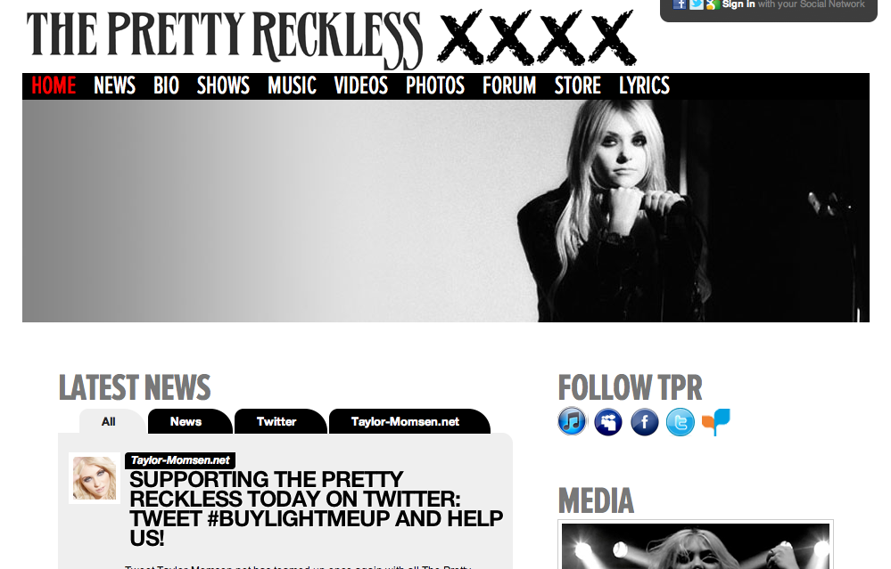
We really wanted to create a strong and powerful brand as well as band and decided up on a logo and rough colour scheme of black and pink to run throughout, with signifiers of the glam rock/ pop rock genre. Tying ourselves to a particular colour can be very effective, as noticed from earlier research into Joss Stone's album cover and demonstrated by band's such as The Pretty Reckless using black, white and red across their website and album.


 |
| Original Idea for Album |
No comments:
Post a Comment