

 |
| Final Logo |
 |
| Original Logo |

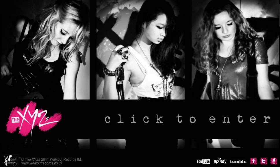
We had decided on a colour scheme of black, white and pink in light of our dress code and styling denoting our genre of glam rock. This decision affected our editing and colour balance on photoshop, our grading on After Effects and our hex codes for the website. We had a particular hex for the pink we used for the logo so every pink you see on the website will be the exact colour used in the logo #EE1C7A. We tried to replicate this colour scheme throughout and as you can see by these swatches the general palette is pretty similar.


 We derived the name of the band from the song itself "You can call me X, you can call me Y, you can call me Z" so we knew it would be important to continue this theme throughout. We amplified the 'alphabet' theme across all products, not only was the ECU of the mouth saying this line a visual motif and hook but our website featuring an alphabet T-shirt in our online store and the album was called 'Exhibit A' in reference to this and the fact it is our first album.

I created a logo for our fictitious record label Walkout Records, featuring heels integrated into the typeface. We reference this in the video with close ups of our feet right at the very beginning just as how in my initial research I noticed how Natalia Kills has badges of her record label in her video.
Other links:
- Walkout Records logo is on album and website and features links to both.
- QR code is on both album and website and links to the Tumblr, Twitter, Facebook and website of the band.
- Our Tumblr, Twitter, Facebook and website contain links to each of the other platforms as well as YouTube links and embeds.
- The video and song can be heard and viewed on our website.
- The online gallery has pictures taken from our music video shoot aswell as the promotional shoot.

We also created a synergetic campaign with Tommy Hilfiger's Loud fragrance. The colour scheme for these adverts were black, white and pink which complimented our image perfectly. In the video I wear Tommy Hilfiger dungarees. This was influenced by the ways in which girl bands like The Saturday's for example have tie ins with cosmetics chain Barry M- featuring their products in the video.

Above all it was clear from our research the importance of fan interactivity so we wanted to ensure it would appeal to our target audience and have plenty of ways to get in touch, via mailing list, the scrolling Twitter feed embedded on the home page and links to other mediums of interaction. We decided not to include a forum or comment box since these seem pretty outdated due to the rise in popularity of other social media platforms.

No comments:
Post a Comment